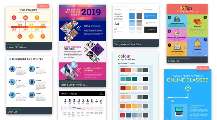
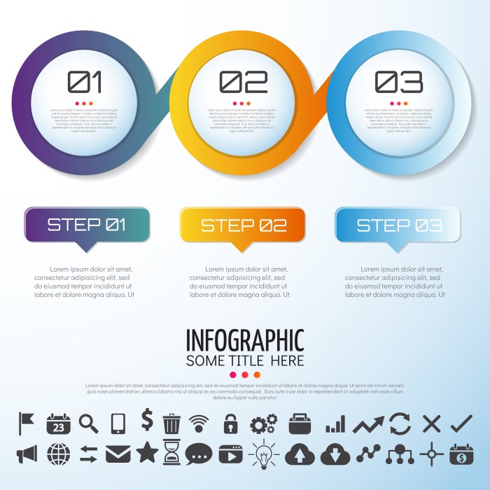
Designing Infographics kicks off with a bang, showcasing the power of visual storytelling to captivate audiences and simplify complex information in a trendy, yet informative way. Get ready to dive into the world of creative data visualization!
As we delve deeper, we’ll explore the key components of compelling infographics, the tools and software needed to bring your ideas to life, design principles for maximum impact, data visualization techniques that make information pop, and strategies for promoting your creations across various platforms. Stay tuned for an exciting journey through the art of infographic design!
Introduction to Designing Infographics
An infographic is a visual representation of information, data, or knowledge intended to present complex information quickly and clearly. It is a valuable communication tool because it helps in simplifying data and engaging audiences through compelling visual elements.
Importance of Visual Elements
Visual elements play a crucial role in conveying complex information effectively. By incorporating images, charts, graphs, and other visual aids, infographics can make data more understandable and memorable for the audience.
Role of Infographics in Simplifying Data
Infographics are essential in simplifying data by breaking down complex information into digestible chunks. Through the use of visual storytelling, infographics can transform overwhelming data into a visually appealing format that is easy to comprehend and retain.
Elements of a Compelling Infographic
When it comes to creating an engaging infographic, there are several key elements that can make a significant difference in capturing the audience’s attention and effectively conveying information. These elements include layout, color scheme, typography, imagery, and storytelling.
Layout
The layout of an infographic plays a crucial role in organizing information in a visually appealing and easy-to-follow manner. A well-designed layout should guide the viewer’s eye from one section to another, leading them through the content seamlessly.
Color Scheme, Designing Infographics
Choosing the right color scheme is essential in creating a visually appealing infographic. Colors can evoke emotions, highlight important information, and create a cohesive look. A harmonious color palette that complements the content can enhance the overall impact of the infographic.
Typography
The typography used in an infographic can greatly influence readability and visual appeal. Selecting the appropriate fonts, sizes, and styles that match the overall theme of the infographic is crucial. Consistency in typography throughout the design ensures a cohesive and professional look.
Imagery
Incorporating relevant and eye-catching imagery can significantly enhance the visual appeal of an infographic. Images, icons, and illustrations can help clarify complex concepts, break up text-heavy sections, and make the content more engaging for the audience.
Storytelling
Storytelling is a powerful tool in infographics as it helps create a narrative flow that captivates the audience. By structuring the information in a storytelling format, infographics can evoke emotions, build connections with the audience, and make the content more memorable and impactful.
Tools and Software for Creating Infographics
Creating visually appealing and informative infographics requires the right tools and software. Let’s explore some popular options and compare their features.
Canva
Canva is a user-friendly graphic design platform that offers a wide range of templates and elements for creating stunning infographics. It is known for its drag-and-drop interface, making it easy for beginners to design professional-looking graphics.
Adobe Illustrator
Adobe Illustrator is a powerful vector graphics editor that provides advanced tools for creating custom infographics. It offers precise control over design elements and allows for intricate detailing and customization.
Piktochart
Piktochart is a web-based tool that specializes in creating infographics, presentations, and posters. It offers a library of templates and icons for users to easily design visually appealing graphics without the need for extensive design skills.
Venngage
Venngage is another online tool specifically designed for creating infographics. It provides a variety of templates, charts, and maps to help users effectively visualize data and information in a compelling way.
Choosing the Right Tool
When selecting a tool for creating infographics, consider the type of infographic you want to create. If you’re looking for a user-friendly platform with pre-designed templates, Canva or Piktochart may be the best choice. For more advanced customization and control, Adobe Illustrator or Venngage could be more suitable options.
Design Principles for Effective Infographics

Visual hierarchy plays a crucial role in guiding the viewer’s attention in an infographic. By using different sizes, colors, and placement of elements, you can direct the audience to focus on key information first, followed by supporting details.
Importance of Consistency in Design Elements
Consistency in design elements such as typography, colors, and graphic styles is essential for creating a cohesive and visually appealing infographic. When all elements align harmoniously, the overall look and feel of the infographic improves, making it easier for viewers to engage with the content.
- Limit the amount of text to essential information to avoid overwhelming the audience.
- Use visuals such as charts, graphs, icons, and images to supplement and enhance the text.
- Ensure a good balance between text and visuals by breaking down information into digestible chunks.
- Choose a color palette that complements the content and helps convey the message effectively.
Here are some tips on balancing text and visuals to create a harmonious and informative infographic:
Data Visualization Techniques in Infographics

Data visualization techniques play a crucial role in creating effective infographics by presenting complex information in a visually appealing and easy-to-understand manner. Let’s explore some common data visualization techniques used in infographics and how they can be utilized to enhance data presentation.
Charts
Charts are a popular data visualization technique that represent numerical data through visual elements such as bars, lines, or pie slices. Bar charts are effective for comparing different categories, while line charts show trends over time. Pie charts are useful for illustrating proportions within a whole.
Graphs
Graphs are visual representations of data relationships and patterns. Line graphs are ideal for showing trends and changes over time, while scatter plots can reveal correlations between variables. Histograms display the distribution of data values.
Maps
Maps are powerful tools for visualizing geographical data and spatial relationships. They can be used to show distribution patterns, demographic information, or location-based trends. Choropleth maps use color gradients to represent data values by region.
Diagrams
Diagrams are visual representations of processes, systems, or relationships. Flowcharts illustrate sequential steps, while Venn diagrams show overlapping relationships between different sets of data. Infographics often use diagrams to simplify complex concepts.
Choosing the Right Technique
When selecting a data visualization technique for an infographic, consider the type of data you are presenting and the message you want to convey. Charts are great for comparing data sets, graphs are useful for showing trends, maps work well for spatial data, and diagrams help simplify complex ideas. Choose the technique that best suits your data and design goals.
Infographic Distribution and Promotion
When it comes to sharing your infographics with the world, there are various strategies you can use to promote them effectively. From social media platforms to websites and email newsletters, the key is to reach your target audience where they are most active.
Optimizing Infographics for
Optimizing your infographics for search engines is crucial to increase their visibility and drive traffic to your website. By including relevant s, meta descriptions, and alt text, you can improve your chances of ranking higher in search results.
- Research and use relevant s related to your infographic content.
- Create a descriptive meta description that summarizes the infographic’s main points.
- Add alt text to your infographic images for better accessibility and .
Collaborating with Influencers and Brands
Collaborating with influencers or other brands can help amplify the reach of your infographics and attract a larger audience. By partnering with individuals or companies that share your target demographic, you can leverage their existing following to increase exposure.
Remember to choose collaborators whose values align with your brand to ensure a successful partnership.
