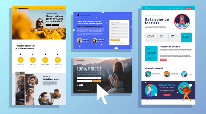
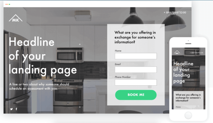
Creating Landing Pages That Convert dives into the art of designing high-converting pages, blending style and substance to captivate users from the get-go.
Explore the key elements and strategies that can turn ordinary pages into conversion powerhouses, revolutionizing your online presence.
Importance of Landing Pages: Creating Landing Pages That Convert

Landing pages play a crucial role in converting website visitors into leads or customers. These pages are specifically designed to guide users towards taking a desired action, such as signing up for a newsletter, making a purchase, or downloading a resource.
Examples of Successful Landing Pages
Creating a well-designed landing page can significantly impact conversion rates. For instance, a landing page that offers a free trial of a software product with a clear call-to-action button can lead to a higher number of sign-ups. Another example is a landing page for an e-commerce store that showcases a limited-time discount offer, encouraging visitors to make a purchase before the offer expires.
Influence of Well-Designed Landing Pages on User Behavior
A well-designed landing page can influence user behavior by creating a seamless and engaging experience. Elements such as compelling headlines, relevant imagery, easy-to-understand copy, and intuitive navigation can capture the user’s attention and encourage them to take action. By optimizing the design and content of a landing page, businesses can increase conversions and ultimately drive revenue.
Design Elements for High Conversions

When it comes to creating a landing page that converts, the design elements play a crucial role in capturing the attention of visitors and guiding them towards taking the desired action. By incorporating key design elements, you can significantly improve the conversion rates of your landing page.
Layout
The layout of your landing page should be clean, organized, and easy to navigate. Use a clear hierarchy to guide visitors towards the most important elements, such as the call-to-action buttons. Make sure the layout is responsive and optimized for both desktop and mobile devices.
Color Schemes
Choosing the right color scheme can have a huge impact on the effectiveness of your landing page. Use colors that evoke the desired emotions and align with your brand. High-converting landing pages often use contrasting colors for call-to-action buttons to make them stand out.
Typography
Typography plays a key role in creating a visually appealing landing page. Use fonts that are easy to read and complement your overall design. Experiment with font sizes, styles, and spacing to create a hierarchy that guides visitors towards important information.
Visual Hierarchy
Visual hierarchy is essential for guiding users towards conversion goals. Make sure important elements such as headlines, images, and call-to-action buttons are prominent and easily noticeable. Use visual cues like arrows or bold fonts to draw attention to key areas of the page.
Compelling Copywriting Techniques
When it comes to creating landing pages that convert, persuasive copywriting plays a crucial role. Compelling copy can grab the visitor’s attention, build trust, and ultimately drive them to take the desired action, whether it’s making a purchase, signing up for a newsletter, or downloading a resource.
Writing Engaging Headlines
Crafting engaging headlines is essential to draw visitors in and entice them to keep reading. Here are some tips for writing compelling headlines:
- Keep it concise and specific to the offer or value proposition.
- Use power words that evoke emotion or curiosity.
- Highlight the main benefit or solution your product/service provides.
Compelling CTAs
Your call-to-action (CTA) is what prompts visitors to take the next step. Make sure your CTAs are compelling by:
- Using action-oriented language that clearly tells visitors what you want them to do.
- Creating a sense of urgency or scarcity to encourage immediate action.
- Positioning your CTA prominently on the page and making it visually stand out.
Clear and Concise Messaging
Clear and concise messaging is key to keeping visitors engaged and guiding them towards conversion. To achieve this:
- Avoid jargon or overly technical language that may confuse or alienate visitors.
- Focus on communicating the value proposition and benefits in a straightforward manner.
- Break up text with bullet points, subheadings, and visuals to make the information easily digestible.
Call-to-Action Optimization
When it comes to maximizing conversions on your landing pages, optimizing your call-to-action (CTA) is crucial. The CTA is the ultimate goal of your page, so you want to make sure it’s compelling and effectively drives action from your visitors.
Strategies for Optimizing CTAs
To optimize your CTAs for maximum conversions, consider the following strategies:
- Make your CTA stand out: Use contrasting colors and bold fonts to draw attention to your CTA button.
- Keep it simple: Use clear and concise language that tells visitors exactly what action you want them to take.
- Create a sense of urgency: Use words like “now” or “today” to encourage immediate action.
- A/B test your CTAs: Experiment with different designs, wording, and placements to see what resonates best with your audience.
Placement, Design, and Wording of CTAs
The placement, design, and wording of your CTAs can greatly impact their effectiveness:
- Placement: Your CTA should be prominently displayed above the fold so visitors don’t have to scroll to find it. It should also be repeated multiple times throughout the page.
- Design: Use a button design that stands out, such as a contrasting color or a bold Artikel. Make sure the button is large enough to be easily clickable on both desktop and mobile devices.
- Wording: Use action-oriented language that clearly tells visitors what to do next. For example, instead of “Learn More,” try “Get Started Now” for a more compelling CTA.
Examples of Effective CTAs, Creating Landing Pages That Convert
Here are some examples of effective CTAs that drive action from visitors:
- “Start Your Free Trial Today” – This CTA clearly communicates the action (starting a free trial) and creates a sense of urgency with the word “today.”
- “Get 50% Off Now” – This CTA entices visitors with a discount and uses the word “now” to prompt immediate action.
- “Join Our Exclusive Community” – This CTA creates a sense of belonging and exclusivity, encouraging visitors to take action to join the community.
Mobile Responsiveness and Page Speed
In today’s digital world, where the majority of internet users access websites through their mobile devices, having a mobile responsive landing page is crucial for maximizing conversions. A mobile responsive design ensures that your landing page adapts to different screen sizes and resolutions, providing a seamless user experience across all devices.
Optimizing for Mobile Devices
When optimizing your landing page for mobile devices, consider the following tips:
- Use a responsive design framework to ensure your page looks great on all devices.
- Optimize images and videos for mobile viewing to reduce load times.
- Keep the layout simple and easy to navigate with touch-friendly buttons and forms.
- Test your landing page on various devices to ensure compatibility and functionality.
Impact of Page Speed
Page speed plays a critical role in user experience and conversion rates. A slow-loading landing page can lead to high bounce rates and decreased conversions. Users expect fast and responsive websites, and if your page takes too long to load, they are likely to abandon it.
To improve page speed and enhance user experience:
- Optimize images and videos to reduce file sizes without compromising quality.
- Minimize HTTP requests by combining CSS and JavaScript files.
- Enable browser caching to store frequently accessed files locally, reducing load times for returning visitors.
- Use a content delivery network (CDN) to distribute content across multiple servers, improving loading speeds for users worldwide.
